


Uncategorised
The African Society for Immunodeficiencies (ASID) is a non-profit organization whose main objectives are to facilitate the exchange of ideas and information among doctors, nurses, biomedical investigators, patients and their families concerned with primary immunodeficiency diseases and also to promote research on causes, mechanisms and treatment of these disorders.
While we have made every effort to ensure that the information contained in this site has been obtained from reliable sources ASID is not responsible for any errors or omissions, or for the results obtained from the use of this information. All information in this site is provided "as is", with no guarantee of completeness, accuracy, timeliness or of the results obtained from the use of this information. The information provided on ASID website is designed to support, not replace, the relationship that exists between a patient/site visitor and his/her physician.
ASID respects the privacy of users of this site. However in the interest of immunodeficiency science, the names and addresses but not email addresses or telephone numbers of members of ASID are listed in the public section of the site web site unless a member specifically requests that it is not displayed by sending an email to . The complete data are known only to ASID and the user/member. The user can access his/her information, verify its accuracy and if necessary, correct it. ASID only forwards personal information if a member specifically requests this.
Certain information such as type of browser used, type of system software and domain name of the provider used, information that is not personal is routinely saved in a protocol file by the ASID web server for internal use only.
Our Website does not host any form of advertisement, it contains links to other websites. ASID makes no representations as to the accuracy or any other aspect of information contained in other websites.
Responsible for the contents of these pages:
Aziz Bousfiha
Professor of Pediatrics.
Head of the Clinical Immmunology Unit.
Casablanca Children Hospital
CHU Averroes.
Medical School. King Hassan II University.
Casablanca. Morocco.
Adresse : 60 Quartier Miamar, rue 2. Californie. Casablanca 16001.Morocco.
Phone : + 661 431 062
Fax : + 522 272 863
JSN Epic was developed with extreme focus on typography and we believe it provides the most comprehensive content presentation capability. Headings, text, links, tables, images, everything was designed with high level of refinement. Let's take a look.
Headings
This is an H1 Header
Lorem ipsum dolor sit amet consectetuer eleifend elit vel tellus laoreet. At ut pellentesque risus quis sem eros et consequat enim lorem. Aenean lorem consequat consequat eu.
This is an H2 Header
Lorem ipsum dolor sit amet consectetuer eleifend elit vel tellus laoreet. At ut pellentesque risus quis sem eros et consequat enim lorem. Aenean lorem consequat consequat eu.
This is an H3 Header
Lorem ipsum dolor sit amet consectetuer eleifend elit vel tellus laoreet. At ut pellentesque risus quis sem eros et consequat enim lorem. Aenean lorem consequat consequat eu.
This is an H4 Header
Lorem ipsum dolor sit amet consectetuer eleifend elit vel tellus laoreet. At ut pellentesque risus quis sem eros et consequat enim lorem. Aenean lorem consequat consequat eu.
This is an H5 Header
Lorem ipsum dolor sit amet consectetuer eleifend elit vel tellus laoreet. At ut pellentesque risus quis sem eros et consequat enim lorem. Aenean lorem consequat consequat eu.
This is an H6 Header
Lorem ipsum dolor sit amet consectetuer eleifend elit vel tellus laoreet. At ut pellentesque risus quis sem eros et consequat enim lorem. Aenean lorem consequat consequat eu.
Text columns
You can arrange content in multiple columns by using very simple html code. JSN Epic will detect the amount of columns you defined and automatically make arrangement.
Usage: <div class=”grid-layout”><div>Text in column 1</div><div>Text in column 2</div></div>
Content arranged in 2 columns
Text column
Lorem ipsum dolor sit amet consectetuer eleifend elit vel tellus laoreet. At ut pellentesque risus quis sem eros et consequat enim lorem. Aenean lorem consequat consequat eu.
Text column
Lorem ipsum dolor sit amet consectetuer eleifend elit vel tellus laoreet. At ut pellentesque risus quis sem eros et consequat enim lorem. Aenean lorem consequat consequat eu.
Content arranged in 3 columns
Text column
Lorem ipsum dolor sit amet consectetuer eleifend elit vel tellus laoreet. At ut pellentesque risus quis sem eros et consequat enim lorem. Aenean lorem consequat consequat eu.
Text column
Lorem ipsum dolor sit amet consectetuer eleifend elit vel tellus laoreet. At ut pellentesque risus quis sem eros et consequat enim lorem. Aenean lorem consequat consequat eu.
Text column
Lorem ipsum dolor sit amet consectetuer eleifend elit vel tellus laoreet. At ut pellentesque risus quis sem eros et consequat enim lorem. Aenean lorem consequat consequat eu.
Content arranged in 4 columns
Text column
At ut pellentesque risus quis sem eros et consequat enim lorem. Aenean lorem consequat consequat eu.
Text column
At ut pellentesque risus quis sem eros et consequat enim lorem. Aenean lorem consequat consequat eu.
Text column
At ut pellentesque risus quis sem eros et consequat enim lorem. Aenean lorem consequat consequat eu.
Text column
At ut pellentesque risus quis sem eros et consequat enim lorem. Aenean lorem consequat consequat eu.
Content arranged in 5 columns
Text column
Lorem ipsum dolor sit amet consectetuer eleifend elit vel tellus laoreet.
Text column
Lorem ipsum dolor sit amet consectetuer eleifend elit vel tellus laoreet.
Text column
Lorem ipsum dolor sit amet consectetuer eleifend elit vel tellus laoreet.
Text column
Lorem ipsum dolor sit amet consectetuer eleifend elit vel tellus laoreet.
Text column
Lorem ipsum dolor sit amet consectetuer eleifend elit vel tellus laoreet.
Text styles
Preformatted text (<pre> tag)
div.grid-layout2 div.grid-col {
 float: left;
 width: 49.95%;
}
div.grid-layout3 div.grid-col {
 float: left;
 width: 33.3%;
}
Quote text (<blockquote> tag)
You can us this style to quote somebody's speech, idea or a fragment from some book, articles, etc. Lorem ipsum dolor sit amet consectetuer eleifend elit vel tellus laoreet. At ut pellentesque risus quis sem eros et consequat enim lorem. Aenean lorem consequat consequat eu.
Usage: <blockquote>This is your quote</blockquote>
Drop Cap
You can use this special drop cap symbol style for magazine / newspaper text paragraph. Lorem ipsum dolor sit amet consectetuer eleifend elit vel tellus laoreet. At ut pellentesque risus quis sem eros et consequat enim lorem. Aenean lorem consequat consequat eu.
Usage: <p class="text-dropcap">This is the text with dropcap symbol.</p>
Highlighted Text
You can use this style to highlight important words and / or keyword expression in search result page. Lorem ipsum dolor sit amet consectetuer eleifend elit vel tellus laoreet. At ut pellentesque risus quis sem eros et consequat enim lorem. Aenean lorem consequat consequat eu.
Usage: <span class="text-highlight">This is the text to be highlighted.</span>
Highlighted Text on mouse over
You can use this style to highlight important text block on mouse over. Just roll mouse over this text block to see how it's highlighted.
Usage: <div class="text-box-highlight">This is the text to be highlighted.</div>
You can use this style to highlight important text block on mouse over. Just roll mouse over this text block to see how it's highlighted.
Usage: <div class="text-box-highlight">This is the text to be highlighted.</div>
Alert Text
You can use this style for alert or warning text paragraph requiring user's attention. At ut pellentesque risus quis sem eros et consequat enim lorem. Aenean lorem consequat consequat eu.
Usage: <p class="text-alert">This is text that requires user's attentions.</p>
Info Text
You can use this style for regular information text paragraph that does not require much user's attentions. At ut pellentesque risus quis sem eros et consequat enim lorem. Aenean lorem consequat consequat eu.
Usage: <p class="text-info">This is your d text.</p>
Download Text
You can use this style for information text paragraph related to download process. At ut pellentesque risus quis sem eros et consequat enim lorem. Aenean lorem consequat consequat eu.
Usage: <p class="text-download">This is download related text.</p>
Tip Text
You can use this style for useful information like tips, hint or help text. At ut pellentesque risus quis sem eros et consequat enim lorem. Aenean lorem consequat consequat eu.
Usage: <p class="text-tip">This is yourtip hint or help text.</p>
Comment Text
Attachment Text
Video Text
You can use this style for description text paragraph that related to video file. At ut pellentesque risus quis sem eros et consequat enim lorem. Aenean lorem consequat consequat eu.
Usage: <p class="text-video">This is your video related text.</p>
Audio Text
You can use this style for description text paragraph related to audio file. At ut pellentesque risus quis sem eros et consequat enim lorem. Aenean lorem consequat consequat eu.
Usage: <p class="text-audio">This is your audio related text.</p>
Link Styles
Link Icon Styles
You can attach up to 20 predefined icons to the front of any link by adding simple class to it.
Usage: <a class="link-icon jsn-icon-xxx">This is link text.</a>, where xxx is the name of icon to be applied. Detailed information about all icon names can be found in template documentation.
Example: <a class="link-icon jsn-icon-download">This is link to download something.</a>
Link Button Styles
JSN Epic offers 6 button styles to decorate any call-to-action links you have in the content.
Usage: <a class="link-button button-xxx">This is link text.</a>, where xxx is the button color name selected from: light, dark, green, orange, blue and red.
Example: <a class="link-button button-orange">See plans & pricing.</a>
Combination of Button and Icon Styles
You can use both button and icon link style combined.
Usage: <a class="link-button button-xxx"><span class="link-icon jsn-icon-yyy">This is link text.</span></a>, where xxx and yyy are button color and icon names respectively.
Example: <a class="link-button button-green"><span class="link-icon jsn-icon-cart">Add to cart.</span></a>
Extension link styles
JSN Epic is able to attach not only descriptive icon to the front of link as described in above section, but also 23 extension icons to the end of the link.
All icons can be assigned automatically by enabling a template parameter or manually by adding simple class to the link.
Usage: <a class="link- jsn-icon-ext jsn-icon-ext-xxx">This is link text.</a>, where xxx is the icon name. Detailed information about all icon names can be found in template documentation.
Table Styles
Plain Rows table style
| Table header | Column header 1 | Column header 2 | Column header 3 |
|---|---|---|---|
| Table footer | Footer data | ||
| Row header 1 | Lorem ipsum | Dolor sit amet | Lorem ipsum |
| Row header 1 | Lorem ipsum | Dolor sit amet | Lorem ipsum |
| Row header 1 | Lorem ipsum | Dolor sit amet | Lorem ipsum |
| Row header 1 | Lorem ipsum | Dolor sit amet | Lorem ipsum |
| Row header 1 | Lorem ipsum | Dolor sit amet | Lorem ipsum |
Color Stripes table style
| Table header | Column header 1 | Column header 2 | Column header 3 |
|---|---|---|---|
| Table footer | Footer data | ||
| Row header 1 | Lorem ipsum | Dolor sit amet | Lorem ipsum |
| Row header 1 | Lorem ipsum | Dolor sit amet | Lorem ipsum |
| Row header 1 | Lorem ipsum | Dolor sit amet | Lorem ipsum |
| Row header 1 | Lorem ipsum | Dolor sit amet | Lorem ipsum |
| Row header 1 | Lorem ipsum | Dolor sit amet | Lorem ipsum |
Grey Stripes table style
| Table header | Column header 1 | Column header 2 | Column header 3 |
|---|---|---|---|
| Table footer | Footer data | ||
| Row header 1 | Lorem ipsum | Dolor sit amet | Lorem ipsum |
| Row header 1 | Lorem ipsum | Dolor sit amet | Lorem ipsum |
| Row header 1 | Lorem ipsum | Dolor sit amet | Lorem ipsum |
| Row header 1 | Lorem ipsum | Dolor sit amet | Lorem ipsum |
| Row header 1 | Lorem ipsum | Dolor sit amet | Lorem ipsum |
List styles
Standard list styles
Unordered list
- Lorem ipsum dolor sit amet
- Consetetur sadipscing elitr
- Sed diam voluptua
Ordered list
- Lorem ipsum dolor sit amet
- Consetetur sadipscing elitr
- Sed diam voluptua
Arrow list styles
Red arrow
- Lorem ipsum dolor sit amet
- Consetetur sadipscing elitr
- Sed diam voluptua
Blue arrow
- Lorem ipsum dolor sit amet
- Consetetur sadipscing elitr
- Sed diam voluptua
Green arrow
- Lorem ipsum dolor sit amet
- Consetetur sadipscing elitr
- Sed diam voluptua
Icon list styles
Article icon list
Folder icon list
Image icon list
Online icon list
Star icon list
User icon list
You can assign any of predefined 20 icons to list items. 6 icons shown above are just samples.
Number list styles
Blue Bullet number list
- Lorem ipsum dolor sit amet
- Consetetur sadipscing elitr
- Sed diam voluptua
Green Bullet number list
- Lorem ipsum dolor sit amet
- Consetetur sadipscing elitr
- Sed diam voluptua
Grey Bullet number list
- Lorem ipsum dolor sit amet
- Consetetur sadipscing elitr
- Sed diam voluptua
Orange Bullet number list
- Lorem ipsum dolor sit amet
- Consetetur sadipscing elitr
- Sed diam voluptua
Red Bullet number list
- Lorem ipsum dolor sit amet
- Consetetur sadipscing elitr
- Sed diam voluptua
Violet Bullet number list
- Lorem ipsum dolor sit amet
- Consetetur sadipscing elitr
- Sed diam voluptua
Blue Digit number list
- Lorem ipsum dolor sit amet
- Consetetur sadipscing elitr
- Sed diam voluptua
Green Digit number list
- Lorem ipsum dolor sit amet
- Consetetur sadipscing elitr
- Sed diam voluptua
Grey Digit number list
- Lorem ipsum dolor sit amet
- Consetetur sadipscing elitr
- Sed diam voluptua
Orange Digit number list
- Lorem ipsum dolor sit amet
- Consetetur sadipscing elitr
- Sed diam voluptua
Red Digit number list
- Lorem ipsum dolor sit amet
- Consetetur sadipscing elitr
- Sed diam voluptua
Violet Digit number list
- Lorem ipsum dolor sit amet
- Consetetur sadipscing elitr
- Sed diam voluptua
Login


Partners


Visitors Counter
 | Today | 87 |
 | Yesterday | 201 |
 | This Week | 288 |
 | This Month | 7316 |
 | All Days | 955457 |
HONcode
 This site complies with the HONcode standard for trustworthy health information:
verify here.


 Rwanda
 Cameroun
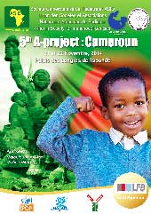
 Zambia
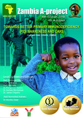
 Gabon
Gabon
 Sudan
Sudan
 Benin
Benin
You can use this style for comment text paragraph. At ut pellentesque risus quis sem eros et consequat enim lorem. Aenean lorem consequat consequat eu.
Usage: <p class="text-comment">This is your comment text.</p>